
What is the best font for a medical website?
The best font for a medical website is a plain, familiar sans serif. Patients should be able to read it at a comfortable size, on any screen.
Set body text at 16 pixels or larger. If many of your patients are older, consider about 19 pixels. Good free starting points, as of November 2026, are Atkinson Hyperlegible Next, Source Sans 3, Open Sans, and Inter. For headings or long articles, Source Serif 4 and Merriweather work well.
No font is accessible on its own, though. The checks that matter test how your text behaves. They look at contrast, spacing, and what happens when a patient enlarges it. This guide covers what patients need and what hospital websites actually use. It then explains the WCAG 2.2 benchmarks, a verified shortlist, and a short test for your own site.
What patients need from the text on a clinic website
A search for medical fonts turns up decorative logo fonts with crosses and pulse lines. This guide is about something else: the text patients read on your website.
That text has a harder job than most. The W3C Web Accessibility Initiative notes that many older people have declining vision. That includes reduced contrast sensitivity, color perception, and near focus.
Stress matters too. The U.S. Department of Health and Human Services (HHS) says anyone can misunderstand health information. The risk rises when the topic is complex, or when the reader is stressed or sick. That guidance comes from its Health Literacy Online guide.
The same guide notes that readers with limited literacy may try to read every word when the stakes feel high. Dense blocks of text get skipped, and online forms are especially hard.
So the text that needs the most care is rarely your logo. It is the intake form, the prep instructions, the insurance page, and the directions to your office.
Some patients go further and change the text themselves. The W3C notes that a reader may switch to a wider font than the one you chose. Your site should keep working when they do.
What hospital websites use, and why popularity is not a reason
One WordPress theme vendor, ILOVEWP, counted the Google Fonts used on 24,654 hospital websites worldwide. Its list of the most used Google Fonts on hospital websites was last updated on November 26, 2024.
The top five are below. Each site can load several fonts, so the shares overlap and do not add to 100 percent.
| Font | Hospital websites using it | Share of the 24,654 sites |
|---|---|---|
| Open Sans | 5,282 | 21.4% |
| Roboto | 4,967 | 20.1% |
| Montserrat | 2,470 | 10.0% |
| Roboto Slab | 2,430 | 9.9% |
| Lato | 2,244 | 9.1% |
The vendor does not publish how it collected the data. The count covers only sites that load Google Fonts, in every country, and it is about two years old. Treat it as a rough picture, not a survey of United States hospitals.
Open Sans at the top is reassuring. HHS names it among the familiar sans serif fonts it suggests for health websites.
But popularity tells you what was easy to install, not what works for your patients. A popular font set too small, too light, or too tight still fails. Fonts built for low vision readers, such as the Atkinson Hyperlegible family, do not appear anywhere in that top 100 list.
The WCAG 2.2 benchmarks that shape font choice
The Web Content Accessibility Guidelines (WCAG) 2.2 are the W3C’s technical standard for accessible web content. The current version is dated December 12, 2024.
WCAG 2.2 does not name or approve any typeface. Its text criteria test how your text behaves on the page. These are technical accessibility benchmarks. This article is design guidance, not legal advice about the Americans with Disabilities Act or any other law.
Four Level AA criteria do most of the work for font choice.
Contrast (Success Criterion 1.4.3)
Success Criterion 1.4.3 asks for a contrast ratio of at least 4.5:1 for body text. Large text needs at least 3:1. WCAG defines large text as at least 18 point, or 14 point bold. Text in a logo has no contrast requirement.
Font weight affects this. The W3C notes that thin or unusual fonts can render fainter than their set color. It encourages fonts with stronger strokes, or colors that beat the minimum. HHS adds that dark text on a white or very light background is the easiest to read.
Resize text (Success Criterion 1.4.4)
Under Success Criterion 1.4.4, text must enlarge to 200 percent without assistive technology. Nothing should be lost when it does.
Wide fonts inside fixed-width buttons and menus are where this usually breaks. Set sizes in relative units, such as rem or em, so text scales with the browser.
Text spacing (Success Criterion 1.4.12)
A patient may override your spacing with a browser tool. Under Success Criterion 1.4.12, nothing should be cut off or overlap when they apply these four settings:
- Line height of 1.5 times the font size
- Space after paragraphs of 2 times the font size
- Letter spacing of 0.12 times the font size
- Word spacing of 0.16 times the font size
Your design does not have to use these values. It only has to survive them. Tightly spaced display fonts and fixed-height boxes are the usual failures.
Reflow (Success Criterion 1.4.10)
Success Criterion 1.4.10 asks content to work at a width of 320 CSS pixels without scrolling sideways. That equals a 1280 pixel wide window zoomed to 400 percent. Oversized heading fonts and long unbroken words often fail here first.
Body fonts that hold up for patients
These four families are free on Google Fonts and licensed under the SIL Open Font License, as of November 2026. Each description comes from the font’s publisher, not from our own testing.
| Font | Made by | What its publisher says | Worth knowing |
|---|---|---|---|
| Atkinson Hyperlegible Next | Braille Institute and partners | Designed to improve legibility and readability for people with low vision | Braille Institute says it is free for personal and all commercial use. It has seven weights with italics. |
| Source Sans 3 | Paul D. Hunt for Adobe | A sans serif intended to work well in user interfaces | Earlier versions were named Source Sans Pro, so older guides use that name. |
| Open Sans | Steve Matteson | Open forms, optimized for print, web, and mobile interfaces | It is the most used font in the hospital count above, so it will not set you apart. |
| Inter | Rasmus Andersson | Designed for computer screens, with a tall x-height for readability | It offers a slashed zero and tabular numbers as optional OpenType features. These can help digits line up in times and phone numbers. |
Atkinson Hyperlegible Next deserves a closer look. Its Braille Institute page shows how letters that look alike are drawn to look clearly different. A capital I, a lowercase l, and the number 1 are good examples. The 2025 version also supports over 150 languages.
How do you choose between them? If many patients are older or have low vision, start with Atkinson Hyperlegible Next. If you want a quiet, neutral voice with a matching serif, use Source Sans 3. Open Sans and Inter are safe, familiar picks for most practices.
You may see Public Sans recommended in older guides. GSA’s Digital.gov now says it is no longer maintained, so we left it off this list.
Serif fonts for headings and longer articles
Should a clinic use serif fonts at all? HHS says the research on serif versus sans serif is inconclusive. It still recommends sans serif for web text. One reason it gives is that serifs may be harder for some readers with dyslexia.
The U.S. Web Design System takes a softer line. It says serif faces can suit long reading, and that the sans serif norm is not a hard rule.
A practical split works for most practices. Use a sans serif for body text, menus, buttons, and forms. Use a serif, if you want one, for headings or long patient education articles.
Four free serif options stand out, described here in their publishers’ words. Source Serif 4 was designed to complement Source Sans 3. Merriweather was designed to be pleasant to read on screens, and the U.S. Web Design System includes it.
Newsreader is intended for continuous on-screen reading. Lora is a moderate-contrast text face suited to body text. All four are under the SIL Open Font License, as of November 2026.
Skip hairline display serifs for anything a patient must read. Thin strokes are the ones the W3C warns can render faint.
Font size, line length, and spacing for medical text
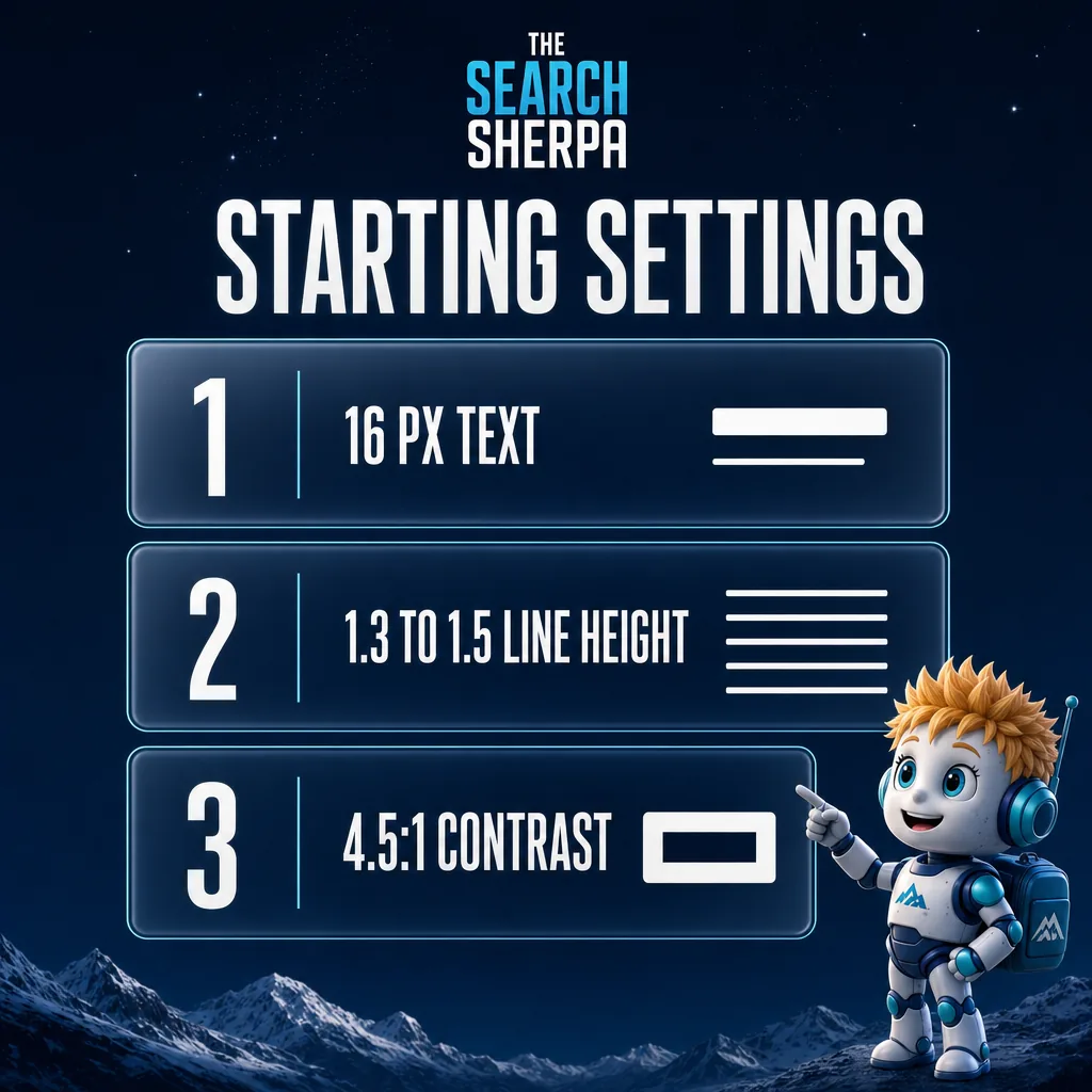
The right font at the wrong settings still fails patients. These starting points come from federal guidance written for health and government websites, current as of November 2026.
| Setting | Starting point | Source |
|---|---|---|
| Body text size | At least 16 pixels. Consider about 19 pixels for older adults or people with vision problems. | HHS Health Literacy Online; U.S. Web Design System |
| Line height | 1.3 to 1.5 times the font size | HHS Health Literacy Online |
| Spacing tolerance | Layout still works with line height of 1.5 and wider letter and word spacing | WCAG 2.2, criterion 1.4.12 |
| Line length | 45 to 90 characters, about 66 for long text | U.S. Web Design System |
| Contrast | At least 4.5:1 for body text, with dark text on a very light background | WCAG 2.2, criterion 1.4.3; HHS |
| Emphasis | Avoid long runs of capitals, bold, or italics | U.S. Web Design System |
For line length, the stricter Level AAA criterion 1.4.8 uses 80 characters as its reference width. HHS also suggests letting users adjust text size. Check on a phone too, because dense screens can make text look smaller.
Clear heading levels help as much as type size. Our guide to heading structure in WordPress shows how to set them up.
Licensing and hosting: Google Fonts, paid fonts, and self-hosting
As of November 2026, Google Fonts’ own records list every font in this guide under the SIL Open Font License.
The license lets you use, embed, and redistribute the fonts. Its main limit is that nobody may sell the font file by itself, which does not affect a practice website.
You can load these fonts from Google Fonts or host them on your own server. The license FAQ says both are explicitly allowed.
If you self-host, use the font files as Google Fonts distributes them. The license FAQ says converting or subsetting a font file can count as modifying it. Some of these families also carry Reserved Font Names, which a modified version normally may not use. Check the license file in the download before you trim or convert anything.
Self-hosting also means a patient’s browser does not contact a third-party font server. Do not assume it is faster, though. Google’s web.dev guidance on fonts says the speed difference is less clear cut than it looks. It depends on a CDN and HTTP/2.
Web fonts can also delay text or shift the layout while they load. Load only the weights you actually use.
Paid foundry fonts are a different case. Each foundry sets its own web license terms, so read them before you build a brand on one.
Is a font change part of a larger rebuild? See our custom WordPress design built for search and speed.
Font pairings by practice type
The pairings below are editorial starting points, not tested outcomes. Adjust them to your brand, then run the checks in the next section.
| Practice type | Body text | Headings | Why it fits |
|---|---|---|---|
| Family and primary care | Source Sans 3 | Source Serif 4 | A matched family keeps pages calm and consistent. |
| Eye care, hearing, and geriatric practices | Atkinson Hyperlegible Next | Atkinson Hyperlegible Next Bold | One family built for low vision, with weight carrying the hierarchy. |
| Dental | Open Sans | Merriweather | Familiar body text with warmer headings. |
| Behavioral health and therapy | Source Sans 3 | Newsreader or Lora | A quieter serif sets an unhurried tone. |
| Specialty and surgical groups | Inter | Source Serif 4 | Clear numbers in body text, with steady headings. |
Run a dental or therapy practice? Our guides to dental practice SEO and marketing for therapists cover the search side.
Aesthetic practices and med spas usually weigh brand mood more heavily. For those brands, see our 35 med spa font pairings, organized by brand personality.
How to test the fonts on your own site
You do not need special software to spot most type problems. Open your homepage, one service page, and your appointment or intake form, then run these five checks.
- Zoom the browser to 200 percent. Text should grow, and nothing should be cut off or hidden.
- Run a text spacing bookmarklet, such as the Text Adaptation Bookmarklet the W3C references. Look for clipped or overlapping text.
- Check body text, link, and button colors in a contrast checker. Aim for at least 4.5:1.
- Narrow the window to 320 pixels wide, or zoom to 400 percent. You should not have to scroll sideways.
- Read the intake form and aftercare instructions on a phone at arm’s length.
Passing these checks is a good sign against four technical benchmarks. It is not a certification, and a full accessibility review covers far more than fonts.
Frequently asked questions
Is there an ADA compliant font?
No typeface is accessible by itself. WCAG 2.2, the W3C’s technical accessibility standard, names no fonts. Its text criteria test contrast, resizing, spacing, and reflow on your actual pages. A plain, familiar font makes those checks easier to pass. This is design guidance, not legal advice.
Should a medical website use serif or sans serif fonts?
Use a sans serif for body text, menus, and forms. HHS says research comparing the two is inconclusive, but it recommends sans serif fonts for web text. A serif can work for headings or long articles if it has sturdy strokes.
What font size should a medical website use?
Use at least 16 pixels for body text. HHS suggests about 19 pixels for older adults or people with vision problems. Whatever size you choose, text must still work when a patient enlarges it to 200 percent.
Are Google Fonts free for a medical practice website?
Yes, for the fonts named in this guide. As of November 2026, each is licensed under the SIL Open Font License, which allows commercial websites to use them. You can load them from Google Fonts or host the files on your own server.
Do fonts made for low vision or dyslexia help patients?
Some fonts are designed with those readers in mind. Braille Institute designed Atkinson Hyperlegible Next for people with low vision. Lexend’s makers say it is intended to reduce visual stress and improve reading performance. That is their stated aim, not an independent finding. Neither font replaces good size, spacing, and contrast.
Should we replace Open Sans or Roboto on our current site?
Usually not for readability alone. Both are widely used on hospital websites. A font swap rarely fixes text that is too small, too light, or too tight. Check size, line height, contrast, and zoom first, then change the font only if your brand needs it.
Is Source Sans Pro the same as Source Sans 3?
Source Sans 3 is the newer version of the same Adobe family, designed by Paul D. Hunt. As of November 2026, Google Fonts lists it only as Source Sans 3. Older guides and themes may still use the earlier name, Source Sans Pro.
Where fonts fit in a practice website
Fonts are one part of a website patients can use. Clear pages, accurate information, and being found in search are the rest. For the search side, see our approach to SEO for medical practices.
The Search Sherpa is a founder-led SEO practice in Mokena, Illinois. You work directly with Jeremy Bengtson. If you want your practice website to be easier to find, easier to understand, and easier to choose, Book a Free Discovery Call.
Explore This Topic
SEO for Auto Repair Shops (2026): How Independent Shops Get Found

SEO for Real Estate Investors: How Motivated Sellers Find You
Vercel vs Netlify vs Cloudflare Pages: Which Free Plan Allows a Business Website?
Best Fonts for Medical and Healthcare Websites: Readable, Accessible, Licensed
Do You Still Need a Website If You Have a Google Business Profile?
Join Over 400,000 Entrepreneurs Getting Our Weekly Newsletter
Recent Posts
November 9, 2026
SEO for auto repair shops in 2026: Google Business Profile categories, repair pages, honest reviews, estimate and warranty copy, and what SEO costs.
November 8, 2026
SEO for real estate investors: build seller-situation pages, set up Google Business Profile within the rules, earn seller trust and track signed deals.
November 8, 2026
Vercel vs Netlify vs Cloudflare Pages for a business website: what each free plan’s terms say, what happens at the limit, and who